
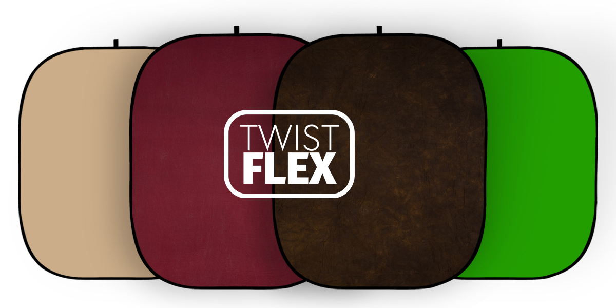
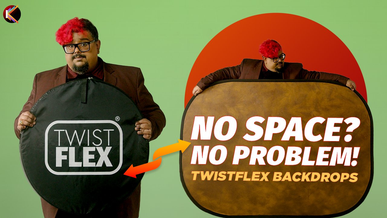
Twistflex Collapsible Backdrops: Meet Your Studio on the Go
We are delighted to announce the launch of our new range of Twistflex backdrops. This brilliant category of collapsible backdrops has g...
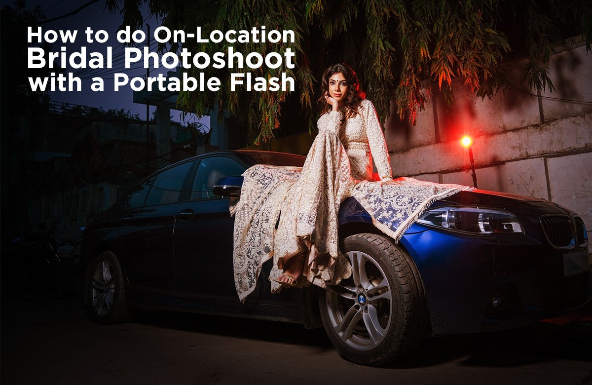
How to do On-Location Bridal Photoshoot with Portable Flash?
https://youtu.be/VZUczCr4SGE?si=U5ubBA2ubb0_MdPJ
A professional bridal photoshoot is more than just about taking be...
Photographer to Entrepreneur: Building a Startup with CEO Archisman Misra
Chatting with the 33-year-old photographer turned startup CEO, who barely sleeps, mentors employees across departments, loves rock musi...
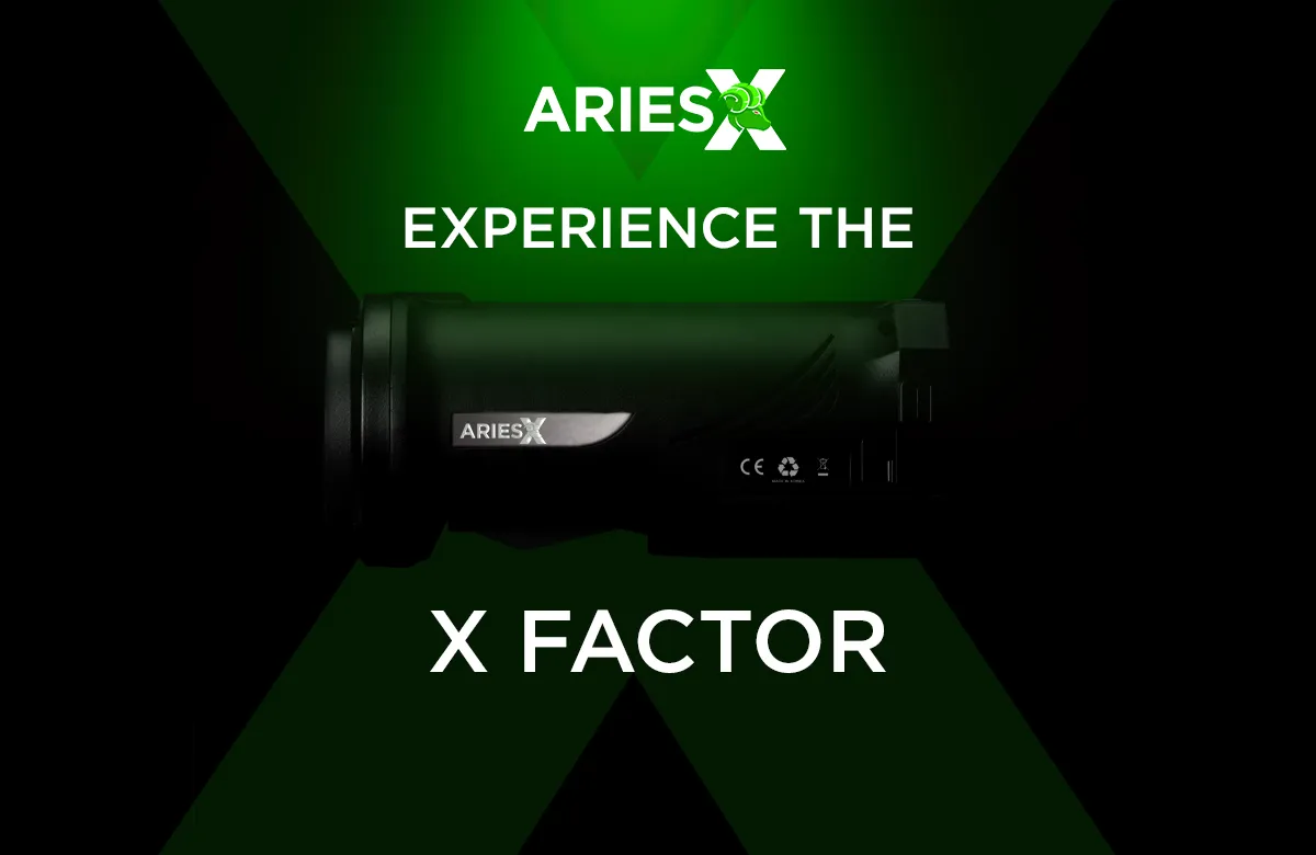
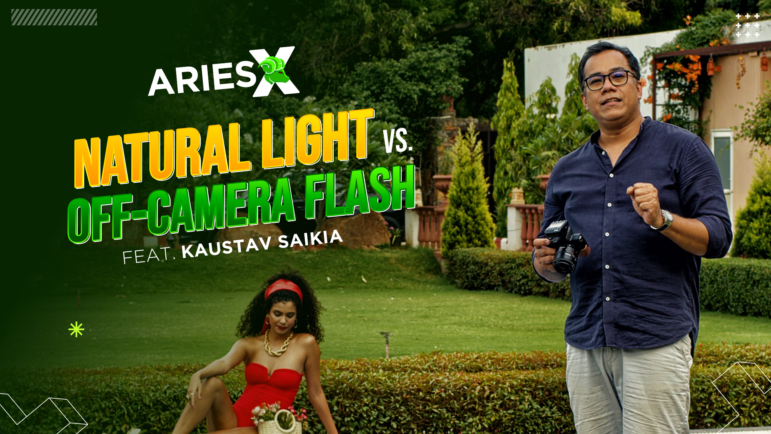
AriesX Studio Flash Launch: The Future of Photography Lights
AriesX brings you a brand new collection that's going to change how you do photography! The new Studio Flash launch brings you four inc...